NYC Dog Data
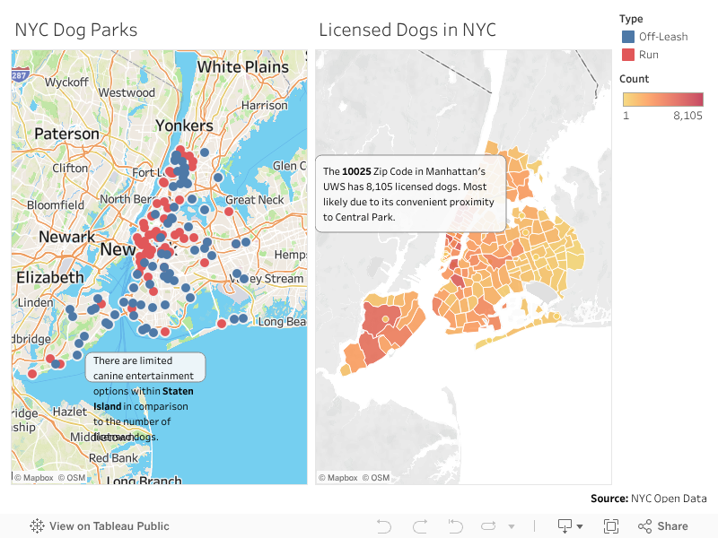
Let's examine the availability of designated dog park locations within the 5 boroughs in comparison to the volume of licensed dogs by zip code. What NYC neighborhoods pass the sniff test and which ones just lay down and roll over.
Company
Infographics & Data Visualization Course Project
Year
2020
Services
Initial Insights (Tableau)
Prototype (Sketch)
Final (Bootstrap, Mapbox GL JS, Mapbox Studio, D3.js)
Initial Insights
The first part of the assignment was to find some preliminary datasets regarding your topic of interest for the project and then create either a dashboard or a data story using Tableau.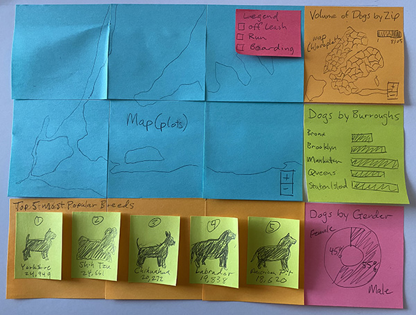
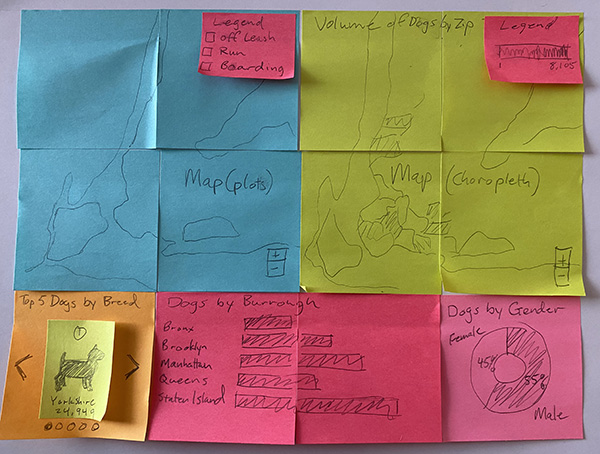
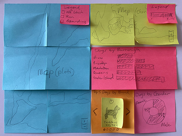
Sketching
The next step in the project was to sketch 3 designs that will become the final design. I utilized post-its in an effort to have the ability to create quickly rearrange dashboard components in order to find the desired layout.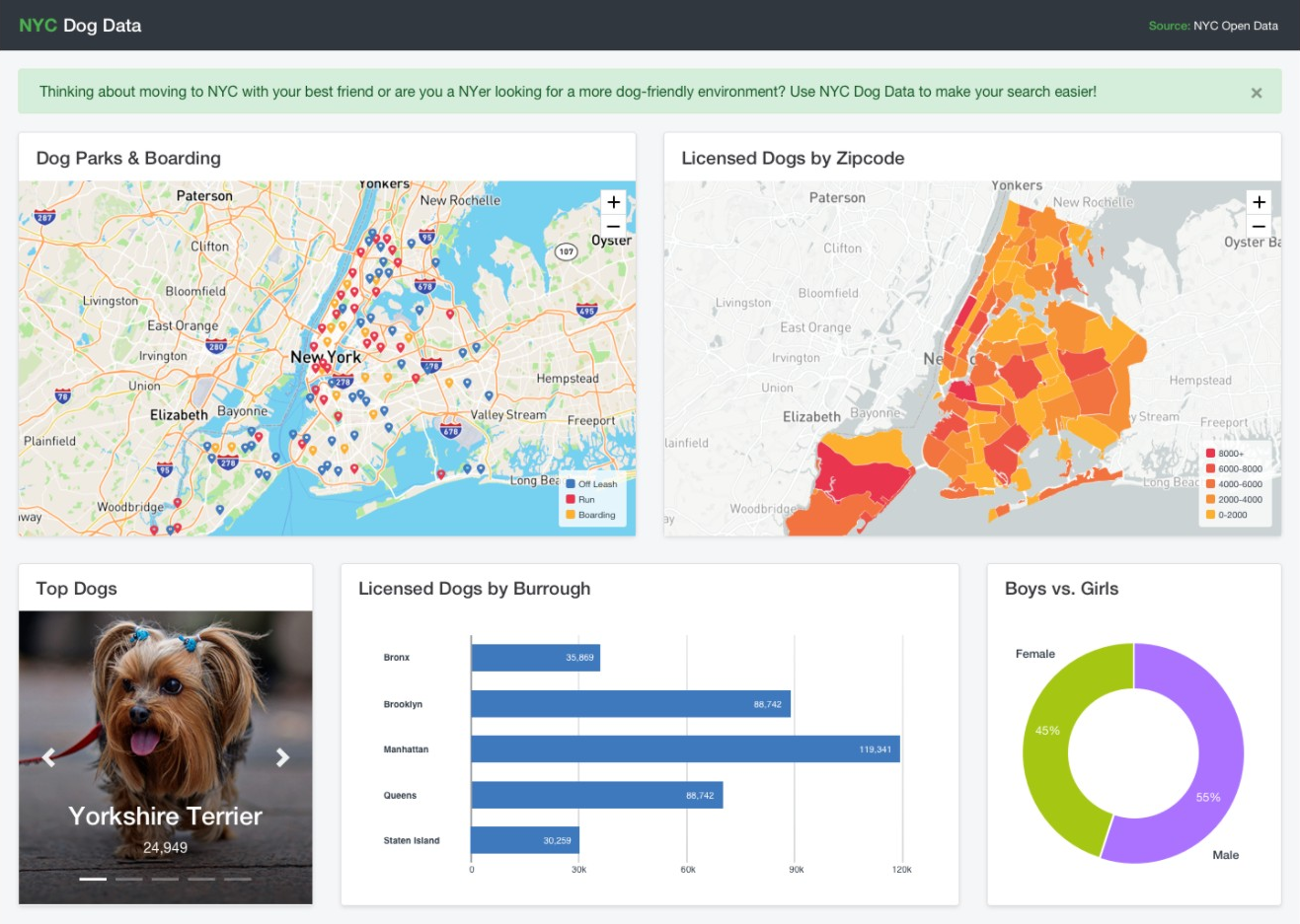
Prototype (Sketch)
After deciding on the layout, I proceeded to design a desktop version of the dashboard with Sketch. You can dismiss the notification, select the plotted map to toggle the infobox example, and scroll through the "Top Dogs" carousel.
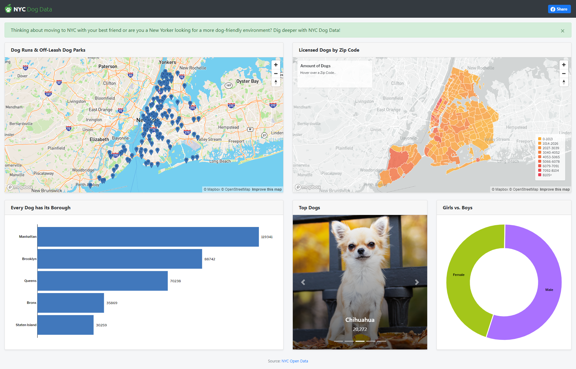
Final (Bootstrap, Mapbox GL JS, Mapbox Studio, D3.js)
-
Alert (Bootstrap)
- User can choose to dismiss the green alert after reading.
-
Map 1 (Mapbox GL JS)
- Displays markers of locations for Dog Runs and Off-Leash Dog Parks.
- Select a marker and an infobox will appear that provides the name, location, and type.
-
Map 2 (Mapbox GL JS, Mapbox Studio)
- A choropleth map that displays the amount of licensed dogs by Zip Code when the user hovers over a zip code.
- The map also shows the density of each zip code by color indicators.
-
Horizontal Bar Chart (D3.js)
- Display the total amount of licensed dogs by borough
-
Carousel (Bootstrap)
- Shows the top 5 dogs by volume in NYC and provides the total amount per dog.
-
Donut Chart (D3.js)
- Displays the % of total female and male dogs in NYC.
- User can hover over each slice to view the total amount per %.